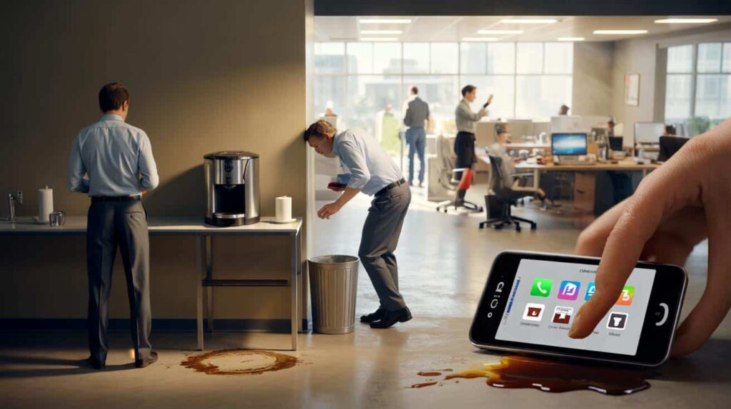
The coffee machine had been moved three meters to the left. That’s all. Same office, same brand, same mugs, same sleepy people at 8:47 a.m. But that Monday, half the team walked straight to the old empty corner, paused, frowned, then did a small, awkward pivot toward the new spot. Nobody said, “Who moved the coffee machine?” out loud. Yet the frustration hung in the air like steam over the cappuccino foam.
It was just a tiny change in placement.
By 9:15 a.m., two people had spilled coffee, one had bumped into the trash can, and one had decided they were “cutting down on caffeine anyway.” All because the machine wasn’t where their brain expected it to be.

Here’s the quiet truth: placement shapes how we use things before we even think about it.

Why placement quietly decides what gets used (and what gets ignored)
Open your phone right now and look at your home screen. Be honest: you mostly tap the icons in the same two or three spots, right? Those bottom corners, that center row. The apps that live there feel “essential”, almost part of your muscle memory.
Shift one of them to a new spot and you feel slightly lost, even if it’s just for half a second. That half second matters. It’s friction. Tiny, invisible, annoying friction. And that friction decides what survives in your daily routine and what gets quietly abandoned.
Placement doesn’t just support usability. Placement writes the rules of what you’ll actually use.
A design agency I visited last year had a lovely “feedback tablet” at the exit. Sleek stand, nice screen, funny emojis to rate your visit. They were proud of it. Weeks later, the UX lead admitted they had almost no responses. People just walked past.
Then someone did a small, almost silly experiment. They dragged the stand 50 centimeters closer to the door handle. Same tablet. Same emojis. Same design. Response rate jumped by nearly 300% in a week. The only real difference was that your hand, already reaching for the exit, now brushed past the tablet. One small change in position, and suddenly the interaction felt “natural” instead of “extra effort”.
Nothing else had changed. It was the same interface. The only real variable was where it lived.
Our brains are lazy in a very smart way. We save energy by turning repeated actions into patterns, and those patterns are deeply spatial. Wallet always goes on the left side of the bag. Password field is at the top. “Next” button is at the bottom right. Shopping cart icon is on the upper right.
Move things away from those expected zones and people stop, hesitate, or miss them completely. Not because they are stupid or careless, but because their inner autopilot is based on location, not logic. *We don’t scan every screen with perfect attention; we go straight to where we expect the next step to be.*
So when a feature “doesn’t get used”, it’s often not a feature problem. It’s a placement problem wearing a usability mask.

Designing for where the hand and eye actually go
A practical way to respect placement is to track where the hand naturally wants to land. On mobile, it’s usually the lower half of the screen. On desktop, it’s near the center and just to the right. On a physical counter, it’s close to where the feet stop and the hand can reach without stretching.
Start by watching people. Not in a formal lab, just quietly, in real life. See where the thumb hovers when they type a message. Notice where they drop their keys in the hallway. Those spots are your “prime real estate”. That’s where critical actions should live: the main button, the key filter, the search field, the payment confirmation.
**Good placement doesn’t shout. It just sits exactly where you were already going.**
One of the most common mistakes in websites and apps is hiding essential actions at the edges: tiny text links in corners, subtle icons far from the main content, buttons placed just out of thumb reach. Designers love clean screens. Users love reachable screens. Those two desires sometimes crash.
We’ve all been there, that moment when you’re holding your phone with one hand in the metro, trying to tap a button placed in the opposite top corner like it’s playing hard to get. You stretch, you miss, your thumb cramps, you silently curse. Then you close the app.
Let’s be honest: nobody really goes back and “explores all the menus” later. If the crucial thing was too far away the first time, it’s already half forgotten.
“Don’t ask people to move their eyes, hands or feet more than they need,” a senior product manager told me once. “They won’t say it’s tiring, they’ll just never use the feature.”
- Put primary actions where the thumb naturally rests (bottom center or bottom right on mobile).
- Group related elements close together so the eye doesn’t travel a marathon.
- Keep confirmation or “Next” steps in consistent spots from one screen to the next.
- Avoid hiding key options in corners, hover states or tiny icons only designers recognize.
- On physical spaces, place frequently used tools along the main walking path, not “neatly” against distant walls.
Rethinking your spaces: screens, desks, kitchens, lives
Once you start noticing how placement shapes behavior, you can’t unsee it. Suddenly, the reason you never use that expensive blender becomes obvious: it’s buried in the back of a high cabinet. The reason nobody at home refills the soap dispenser is clear: the refill bottle lives in a distant, dark cupboard behind the cleaning products.
The same logic hits your digital life. That learning app “you’re definitely going to use” is on your fourth home screen, in a random folder named “Stuff”. Your budgeting tool is somewhere in the top-right corner of your laptop dock, far from your email and browser. They’re exiled by placement.
Small shifts can feel strangely powerful. Move the healthy snacks to eye level. Drag the reading app to your main dock. Put the project file right next to your favorite tool. Suddenly, the path of least resistance points toward the thing you actually want to do.

| Key point | Detail | Value for the reader |
|---|---|---|
| Prime real estate matters | Areas where eyes and hands naturally land control what gets used most | Helps you decide where to place your most important actions or objects |
| Small shifts, big impact | A few centimeters on a desk or a few pixels on a screen can triple usage | Encourages low-effort experiments instead of costly redesigns |
| Consistency builds autopilot | Keeping key actions in the same spot reduces friction and hesitation | Makes daily tools feel smoother and less mentally tiring |
FAQ:
- Question 1How do I know if a usability issue is really a placement problem?Start by watching people use the interface or space without instructions. If they hesitate, scan around, or miss something that’s right there, try moving that element closer to where their eyes or hands naturally go. If behavior changes without changing the feature itself, you’ve found a placement issue.
- Question 2What’s the easiest placement fix on a website or app?Move the primary action (sign up, pay, send, next) into the most reachable and visually central area. On mobile, that’s usually the lower half of the screen. Then keep that position consistent from screen to screen so people can rely on muscle memory.
- Question 3Does this really matter outside of digital design?Very much so. Kitchen layouts, office desks, workshop benches, even kids’ toy storage all obey the same logic. Objects at eye level and within easy reach get used. Things placed low, high or far away are “for later” and slowly disappear from daily life.
- Question 4How can I test better placement at home or at work?Run one-week experiments. Move one object, tool or button to a new position that’s closer to where actions naturally happen. Don’t announce the change. Just observe: does usage go up, complaints go down, or steps feel faster? If yes, keep it. If not, adjust again.
- Question 5Is there a risk of over-optimizing placement?There can be if you shuffle things constantly. People need stable reference points. The goal is not to move things all the time, but to invest a bit of thought upfront so that once something has a place, that place makes using it almost effortless.