You’re there, half-frozen, holding the pump with one eye on the screen and the other on your bank balance. The price per liter climbs, the total bill races ahead, and you do the same thing as everyone else: you mutter, you squint, you try to guess what you’re really paying for each kilometer.
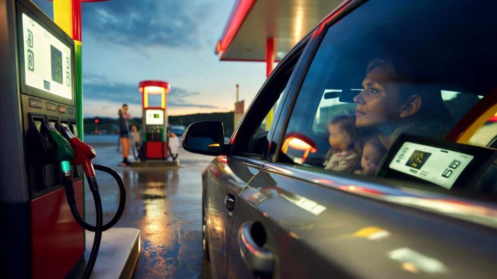
The numbers blink, the queue builds up behind you, and you press “validate” without really understanding.
From February 12, this little ritual will quietly change. A new line of information will appear right where your hand already is. And it could finally give drivers a tiny sense of control.

What gas stations will have to show you from February 12
From February 12, gas stations will have to display a new mandatory piece of data directly at the pump: the average cost per 100 kilometers, based on your fuel. Not just the price per liter, but a concrete estimate of what your car actually “eats” over a realistic distance.

Suddenly, the figures stop being abstract. That number will turn a vague feeling of “this is expensive” into “this trip costs me about X euros”.
Picture a regular weekday evening. A commuter pulls into a service station, already late, kids to pick up, phone buzzing with notifications. They glance at the usual price per liter, sigh, then notice the new line: “Estimated cost per 100 km: €9.20” for their fuel type.
They think about their 40-kilometer daily round trip. Two euros and a bit, every day, just to move from home to work and back. That small line of text connects directly to their life. Suddenly, it’s not only a tank that’s being filled, but a budget that becomes visible.
This obligation responds to a simple reality: people struggle to compare. Between diesel, E10, E85, electricity, and hybrids, the debate is everywhere, but the numbers are muddled. Price per liter versus price per kWh, different tank sizes, different consumption.
By displaying an average cost per 100 kilometers, the state wants to give everyone a common yardstick. It doesn’t magically lower prices, but it changes the mental equation at the pump. **It turns a confusing market into something you can read at a glance.**
How this new display can help you spend less without changing cars
The first trick is almost disarmingly simple: start looking at this new “cost per 100 km” like you look at the price on a supermarket shelf. One glance, one comparison, one decision.
You can mentally match that figure with your regular trips: work commute, weekend visit to family, the monthly big supermarket run. Multiply quickly, round up. You’ll get an immediate feel for what each habit really costs you over a month. That’s where small savings hide, quietly.
Most drivers don’t have the time or energy to run spreadsheets on fuel consumption. They drive “by feel”, refill “when the light turns on”, and hope the card won’t be declined. We’ve all been there, that moment when the pump stops and the amount feels like a punch in the stomach.

This new display can act like a small alarm bell. If one pump shows €8.10 per 100 km and another a few meters away shows €9.40, the choice becomes obvious. On a long year of commuting, that tiny difference can represent a weekend away or new shoes for the kids. *That’s when the numbers stop being cold and start touching daily life.*
Let’s be honest: nobody really sits down and recalculates their real consumption every single day. This is precisely why the reform aims to put an “instant summary” right where your eyes already go.
“People don’t need more data, they need clearer data,” explains a transport economist involved in the measure. “By translating the pump into cost per 100 kilometers, we’re talking the same language as car makers and drivers.”
- New line on the pump: average cost per 100 km
- Same unit for all fuels: petrol, diesel, biofuels, electric
- Easier comparisons before changing car or choosing a fuel
- Concrete view of the budget for daily trips
- Tool for spotting stations that are quietly more expensive
A small number with big questions behind it
Behind this new line on the pump, a deeper conversation starts to open up. People will compare, talk, question their habits. Some will realize that their short trips in heavy traffic cost almost as much per month as a train pass. Others will discover that a slight change of route or schedule lowers their “per 100 km” bill because they hit less congestion.
This new obligation won’t magically solve everything, but it changes the angle: fuel stops becoming just a necessary pain and turns into a reminder that each trip has a price, a choice, and sometimes an alternative.
On social media, you can already imagine the screenshots and photos: two pumps, side by side, with noticeably different “per 100 km” numbers. Friends sending each other the cheapest station in the area. Facebook groups comparing the cost per 100 kilometers of small city cars versus big SUVs, of petrol versus electric.
Some will play the game of guessing their monthly bill before seeing the new figure, then checking if they were right. Others will feel a tiny sting seeing how much their daily 15-minute drive actually adds up over a year. **The emotional shock comes from the clarity.**
For many, this new transparency will also feed into a bigger life question: keep the current car, or change it? Keep driving every day, or mix in public transport, carpooling, cycling? At the pump, with that new line staring back, the decision no longer feels abstract. It’s written down, in euros, every 100 kilometers.
Some will shrug and keep going, others will adjust slowly: one shared trip a week, one less unnecessary round trip, a more efficient car next time. The small number on the screen can become the starting point of long-term changes, shared in families, in offices, between neighbors.

| Key point | Detail | Value for the reader |
|---|---|---|
| New mandatory display | Average cost per 100 km shown at every pump from February 12 | Clearer view of what each trip really costs |
| Common unit for all fuels | Same basis to compare petrol, diesel, biofuels and electric | Helps choose the most economical option for your use |
| Everyday decisions | Connects fueling to daily routes, habits and budgets | Makes it easier to adjust routines and reduce spending |
FAQ:
- Question 1What exactly will gas stations have to display from February 12?
- Question 2Will this new figure change the price I pay at the pump?
- Question 3Is the “cost per 100 km” specific to my car model?
- Question 4Will electric charging stations also show this information?
- Question 5How can I use this new display to really save money over the year?